 |
| Majority of these pictures are our nieces and nephews |
Friday, December 23, 2011
Tuesday, December 20, 2011

Essay for Final History Poster
History on Electricity
My design teaches people that we have grown through time with the technology of Electricity. In my drawing I have shown where we started out with everyday mother nature-lightning and trees, and then went on to show the change in the electric poles from wood to metal (showing the change in technology of harnessing the electric from man). I also showed in my piece the time line showing who and when the inventions and discoveries were made, (I only touched on a few great inventors).
I have used the design principles of emphasis, alignment, flow, repetition, balance, and contrast by emphizing the most important part of the poster (the poles)by making them the darkest part. Then I went onto everything being aligned together and changing the opacity slightly (giving the depth of field) . I used flow in the text of the inventors, in the way I flowed them downwards towards the ground. I also used contrast with all the text. I used the gradient tool for the title, and I used the opacity meter, going from dark (at bottom-most recent), to very light(at top-oldest) for the inventors names and descriptions. I used balance in my placing of the objects and in my design of the poles.
I have designed my poster to the Rule of Thirds by making sure the world is lined up with the bottom of the pole, the text ends at the bottom of the second pole, the title of the poster is lined with the first and second pole, and I made the inventors and their dates flow down the right side of the poster to balance out the title.(my real final is landscape, not portrait-(up above).I had to copy and paste to get this a jpeg file for my blog, so there is no big space at the bottom below the inventors; it is flush and yes the real poster you can read what each inventor did).
When using colors in my poster to represent the change in our world history, it was very fun, interesting, and a little difficult. I had a lot of information, colors, and styles to go through. I chose to go different and use a little art nouveau and a little bauhaus art styles. I used bauhaus style in the metal poles and aligning the other poles with them, I used black for the metal poles, to show the newest first. I then went into using art nouveau style, by the shadows of the browns in the gradient tool of photo shop on the poles, (to show that machines built these poles for us, not our hands). I then used the royal blue and the middle to brighter green on the world, to show the time change from black and white(young and untechnology prone), to bright blue and green (smart and technology sauvy). With the globe itself, I wanted to show that electricity didn't just get invented in one time, place, or continent. Many different cultures invented their own methods from around the world and certain people later reinvented some of these inventions but with newer technology added. I used Impact font on my inventors and their descriptions, because I thought it went well with the style and time frame I was trying to show. I tried making the inventors pop. I want you to see the title first, then the first big power line, and then the inventors and their descriptions. I used a font called Rosewood on my title. I thought that this font showed electric very well. I like the in line design of the text to give it that lightning look inside the letter. I also used the gradient tool going from top(sky) to bottom(ground), with the bright color yellow (trying to portray the lightning hitting the earth way back when Franklin discovered lightning was a form of electric). I wanted to leave a little more than normal negative space this time in my piece for a symbol of the unknown. We have many new inventions that we have yet to create, and there are many inventions that we have done in this lifetime that I did not get the chance to show or credit. There are many neat and interesting inventions that have helped us explore and grow into the human beings that we are today. As of today, we have solar power panels that we can actually attach to our house roofs now, for our own savings on electric. We are building economy friendly houses and appliances for them. We are making cars that run just on one of the electric batteries (Just plug her in!). Robots are becoming more complex. Toys are becoming an unbelievably thing of the past. New toys have lights and tons of electric curcuits to make them move, talk, walk, dance, sleep, and god only knows what else! Amazing what we can do when we come together as a united nation and put our creative minds together.I hope in my lifetime that we can take and put differences aside and grow with the technology that we have learned and built in the past, and take it to a whole new level. Had an awesome time with this project!
Looking back through the Projects
 This is the First Project
 The Commemorative Stamp
 The History Poster
Tuesday, December 13, 2011
My Final with some edits!

Digital piece of History

Tuesday, December 06, 2011


Tuesday, November 29, 2011


Thursday, November 17, 2011

Tuesday, November 08, 2011

Revised stamp

Tuesday, November 01, 2011
1st round thumbnails-in progress

Thursday, October 27, 2011
2nd Round stamp Thumbnails-Digital

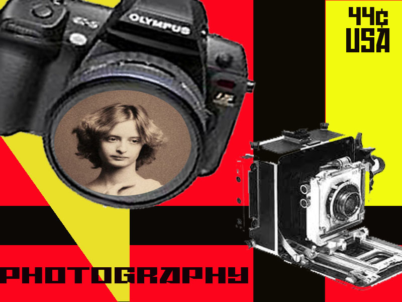


This is a touch up of the one above.I moved 44 cents and USA down and more center in block. Touched
up the old camera frame. These are Russian Constructivism designs by the way the shapes are, straight cutting, and the colors that I chose. I chose to take a russian woman and put her in the digital camera to reflect the older camera.
 Tuesday, October 25, 2011
Russian Constructivism

I liked these examples because it has straight edges yet it has a flow form to them. I like how they merged pictures of people into art work itself. I love the straights with the change in style form and color. The one I like the most is the woman reading with two photos on either side and I love the first example because of the color and shapes intermingling with each other.
Tuesday, October 18, 2011


Different commemorative stamp collage

Wednesday, October 05, 2011
One of my portraits

winter is coming! This is one of my photo's that I took last winter. I shot this with a Canon. I was on Main St. in Binghamton. NY
Tuesday, October 04, 2011

Essay to semi final
I had a very difficult time with this digital project. Well to start I wrote an essay explaining
how I learned that this piece does not conform to the rule of thirds because they do not form and fit together.
Then I went to publish the essay in the comment and the blog refused to publish it and erased my entire essay without saving it so I am forced to rewrite the entire essay again.
To begin, the first digital project I had a difficult time doing. We had to take was six words, which all had
different meanings and forms to them and merge them into one project. I tried to bring these words together by making emphasis bold and the biggest word to draw your eyes to the center of the page directly looking at emphasis because the word itself means to make something noticed instantly. I then took balance and conformed it into a bubble, overlaying emphasis. I tried to show how a bubble is in balance because it is a perfect circle. I then tried making the eye go to contrast next by dropping it on top, off center and boxing in con and italicizing trast and making it slighter thinner. With repetition, I made it too bold and to big. I believe that repetition should be smaller and lighter. I also beleive that in should stretch down and under emphasis and balance and go off the page at the bottom right of the corner. I tried to use the gradient grey scale with flow. I took the pen freeform tool and tried to draw a line with enough fluid coming onto the page and then going off again at the bottom. I beleive that if I take flow and possibly put more curve and change
the font to something more fluid it might make the liquid stand out more in the word. I finally took alignment and put it at the bottom on the right to try and accent the contrast angle and flow. I beleive if I took align and made it on top of trast and made alignment and contrast a little bigger. I would also take alignment and stretch the spaces between the letters.
When doing this project I had a hard time trying to get the bubble slice and trying to get the bubble over the word emphasis. I choose to put emphasis in bigger bolder font in the center to make the eye go directly to the word. Emphasis means to get the point right then and there. I then put balance to the right off center flowing the eye to it. I then tried putting contrast up in the upper left alone trying to portray negative vs. positive space yet directly boxing con and italicizing trast giving it the tweek. I think contrast should be a few font sizes larger and to the left more. I would also stretch the words trast a few degrees. When doing repetitition I had a hard time converting this word into the piece and not having enough time being new do get the effect I wanted. I think if I lighten the letters and wrap the letters off the page down on the right hand side. I believe with these changes with improve this project extremely.
In conclusion, these six words can be put together to conform to be a beautiful master piece. I don't think that this specific piece has the form or fit in the rule of thirds at all. I believe correcting these touches will help add flow and rthym to this piece.
Thursday, September 29, 2011

Sunday, September 25, 2011


Saturday, September 24, 2011


One of my dreams, photography!
Love Rose given by Joe B. with Love

Second Thumbnails 4th drawing
I tried to put balance into a bubble with shade
I tried showing the repetition as grape vines. I did flow as a flowing river at the bottom.


Subscribe to:
Posts (Atom)